Higher Res Icons/Favicons in Windows and Chrome Extension?

Suggestion for Aesthetics in the Windows App.
Hello I am new 1Password user. I really like the IOS and OSX Version.
Could the shortcut icons be updated in Windows 10 to match the quality of the OSX Version?
I find the aesthetics of the Windows Version somewhat lacking.
The simplest place to start would be with enhancing Icons, adding some glimmer and shine to them like the OSX version.
The next issue is the Safety Blue Header Bar is exceptionally obnoxious in Windows. I know we need to stick with the blue color but maybe its height could be decreased or other wise altered?
1Password Version: Not Provided
Extension Version: Not Provided
OS Version: Not Provided
Sync Type: Not Provided
Comments
-
Suggestion for Aesthetics in the Windows App.
Hello I am new 1Password user. I really like the IOS and OSX Version.@tekfranz: First of all, thanks for trying 1Password, and for reaching out to share your thoughts with us. It's greatly appreciated! :chuffed:
Now, I hate to do this to you, but reading your comments I kept going back and forth on which version you're using: some of your suggestions sound like they apply to one, while others another. Can you tell me the OS, 1Password, and device versions you're using, and the exact steps you're taking for context:
Find your version
The more information you can give, the better. If it's simpler, take a screenshot of what you're referring to. To include it in your reply, simply click the document button in the top of the comment field, and select the file you wish to share:
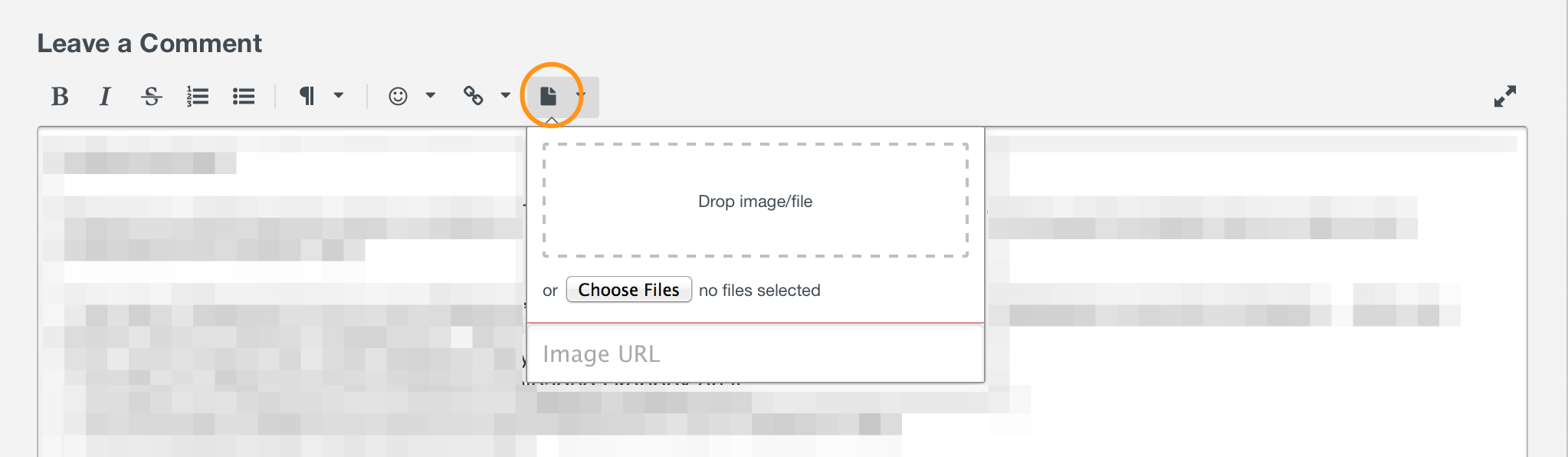
Just be sure not to post anything sensitive, as this is a public forum. Otherwise, if you give me more information on your setup and clarify a few things for me, I may be able to understand without the use of visual aids.
Could the shortcut icons be updated in Windows 10 to match the quality of the OSX Version? I find the aesthetics of the Windows Version somewhat lacking. The simplest place to start would be with enhancing Icons, adding some glimmer and shine to them like the OSX version.
It sounds like you just want us to use the same icons across platforms. I'm not sure that's appropriate, so instead we try to use a consistent design while making them feel at home on each platform.
The next issue is the Safety Blue Header Bar is exceptionally obnoxious in Windows. I know we need to stick with the blue color but maybe its height could be decreased or other wise altered?
But I'm really uncertain as to what you mean by "Safety Blue Header Bar", so I'd appreciate any clarification you can give. Thanks in advance! :)
0 -
1Password Version: 6.5.401d
Extension Version: 4.6.4.90
OS Version: Windows 10
Sync Type: 1Password AccountApologies for omitting the version numbers.
So I am comparing the Windows 10 Version with the OSX Version and my comments pertain to the Windows 10 Version.
The icons do not need to be exactly the same, they just need to look nicer, richer and less grainy in Windows 10.
As far as the header being "Safety Blue" in Windows 10,it is located immediately below the title Bar and contains the Vault Selector, Search Box, Gear Icon and Lock Button. The solid blue background is too bold.
In summary my point is that the Aesthetics of the Windows Version need to be improved to make it look as polished as the OSX version.
0 -
@tekfranz: No need to apologize! Thanks for clarifying. I really appreciate it. :)
The icons do not need to be exactly the same, they just need to look nicer, richer and less grainy in Windows 10.
Are you referring to the icons like these here, in 1Password mini?

They don't seem grainy to me, so I wonder if there's some display issue that needs to be ironed out on some configurations. What are you seeing?
As far as the header being "Safety Blue" in Windows 10,it is located immediately below the title Bar and contains the Vault Selector, Search Box, Gear Icon and Lock Button. The solid blue background is too bold.
Ah, it sounds like you just mean the top of the main 1Password window:

In summary my point is that the Aesthetics of the Windows Version need to be improved to make it look as polished as the OSX version.
I'm not sure I agree that this in particular is a problem, and we haven't had similar feedback from others. But while I don't think that 1Password for Windows needs to look the same as 1Password for Mac, we're in complete agreement that there's still plenty of improvement and polish to be made. Thanks for letting us know your preferences, and please let us know if you have any other thoughts on the new app! :)
0 -
I would point to two icons being grainy. The Main Taskbar Icon and the system tray icon.


As far as 1 Password Mini on Windows 10, the White on Blue is a bit too contrasting. The grey/blue palette/tones look much better on Mac OSX.
The Main Thing that separates 1Password from its competitors is it's polish. That polish should be extended to Windows 10, especially with so many competitors creating cross platform products.
1Password has a big strength in that it looks nice on Mac. I think it would be great if it would like nice on Windows too.
0 -
I would point to two icons being grainy. The Main Taskbar Icon and the system tray icon.
@tekfranz: Thanks for the screenshot! I'm not seeing that at all here:

What resolution and screen size do you have? It may be that your DPI is too low for Windows to use the high-DPI icon, but high enough that they look funny. The others seem to exhibit the same...fuzziness.
As far as 1 Password Mini on Windows 10, the White on Blue is a bit too contrasting. The grey/blue palette/tones look much better on Mac OSX.
Weirdly, we have the opposite comment from a vocal minority of Mac users: they want it to be less muted. We can't please everyone, but we'll keep looking for the right balance. :)
The Main Thing that separates 1Password from its competitors is it's polish. That polish should be extended to Windows 10, especially with so many competitors creating cross platform products. 1Password has a big strength in that it looks nice on Mac. I think it would be great if it would like nice on Windows too.
We feel that way as well. The new 6 Windows desktop app has existed for roughly 9 months, so we're not to the point where we can focus on polishing everything to the level we want, as there are still features and UI elements we need to add. But part of the reason we've gone this route is so that we can use all of Microsoft's latest tools to make 1Password shine on Windows the way we all want it to for years to come. :chuffed:
0 -
It is standard 100% DPI running at 1900x1080 which I believe is the normal widescreen resolution.
Thanks for your time & accepting my feedback. Looking forward to being a happy 1Password user!
0 -
It is standard 100% DPI running at 1900x1080 which I believe is the normal widescreen resolution.
@tekfranz: Ah, so roughly HDTV (1080p) resolution. Yeah, that's about what it looks like when I hook up my Surface to the TV to play games. Unfortunately there isn't anything that can be done about that, as there are only so many pixels to go around. :blush:
Thanks for your time & accepting my feedback. Looking forward to being a happy 1Password user!
Likewise, we'll keep working to make it better. Don't hesitate to reach out with any other comments, questions, or suggestions you might have. And if you want to be among the first to receive the latest stuff, you can always sign up for the beta. Cheers! :)
0 -
-
Hi guys,
I can reproduce the issue if I'm using a lower resolution at 100%. We'll look into optimizing our icons for the 100% scaling.
ref: 1079
0 -
I am really liking the darker blue in the most recent Windows update. Thanks guys!
0 -
Great! I'm glad to hear it. Thanks for letting us know! We've got more where that came from. ;)
0