1Browser Icon

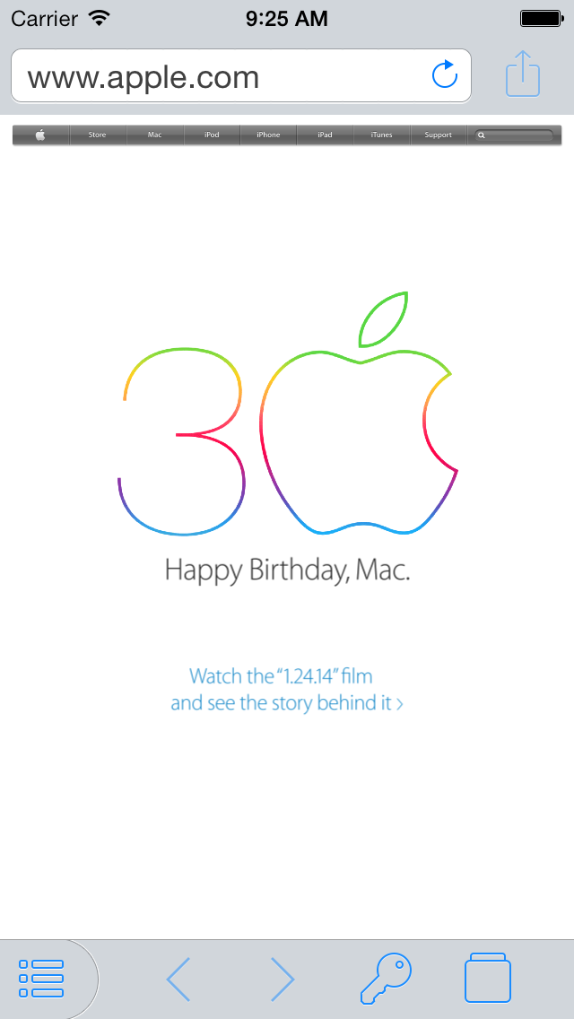
I think the 1Browser icon is a little wispy. Maybe something like these?
https://www.dropbox.com/s/uxzhdyp8ms2koz0/1browser icon.png
https://www.dropbox.com/s/wo1lmtzeic12glg/1browser icon gray.png
Comments
-
I will also pass this one along to Dan, thanks!
best,
Michael Fey
mrrooni@agilebits.com
AgileBits0 -
I am absolutely in favor of @ethansisson 's suggestions. The outline is too thin.
0 -
Thanks @manny, I will add your vote to the list.
Also, as a heads up, we'll be out the rest of the week (I'm on a plane as a type this!) for our annual company retreat. Any new messages between now and Sunday will be answered on Monday.
Thanks for taking the time to write in!
best,
Michael Fey
mrrooni@agilebits.com
AgileBits0 -
I feel the 1Browser tab’s top should line up with the top of the toolbar. Does that make sense? Anyone else feel the same?
0 -
@infodriveway: Like so?
 0
0 -
@MrRooni These should line up. Does this picture help?
 0
0 -
@infodriveway Your image isn't showing up, could you please try again? Thanks!
0 -
-
I understand that it's intended to line up with the toolbar height in 1Browser – presumably so that it looks nice when sliding between the Vault and 1Browser (as opposed to tapping). However, I agree with @infodriveway that it looks odd in the Vault with the new UI (doesn't bother me much in the public release). Not sure what could be done to improve it, but it might be nice to rethink it at some point.
0 -
Ah! Thanks very much for the screenshot, @infodriveway. We'll definitely work on prettying that up before release. And @ethansisson, I totally see what you mean by "wispy" in this screenshot, too. The outline does look rather thin and…tentative. Thanks for the feedback!
0


