Item details Unreadable in Mini with Dark Menubar

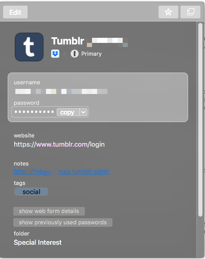
In the first 1Password 7 beta the main item details in 1Password Mini are completely unreadable when the dark menubar and Dock are enabled. See the screenshot:

I fully expect there to be bugs in the first beta, so I’m not hugely surprised, but I wanted to report this.
1Password Version: 7.0 beta 1
Extension Version: only use in Safari, so same as app
OS Version: macOS 10.13.3
Sync Type: 1Password Families
Comments
-
I use Dark Mode and I get this using 7 Beta 4 on it.
Is it because I'm not registered yet?
I know passwords can be show or not but the color scheme is hard to read for me. I have to mouse the mouse until the copy button "appears".
1Password Version: Not Provided
Extension Version: Not Provided
OS Version: Not Provided
Sync Type: Not Provided0 -
move the mouse* :)
MacOS 10.13.40 -
It's a bug: see this thread.
Stephen
0 -
I’ve merged a couple of threads on the same subject. Please see above. Thanks.
Ben
0 -
When I try to view or copy username/passwords using the new in-app extension for Safari I get the attached display. The username and password labels need to be darker and the username/password data does not display correctly if at all.
Also I cannot enter any data in the Additional Information fields on this form so here is the info:
Version (1Password) 7 Beta-4
In-App Extension
OS 10.13.4
Sync Type: Family Subscription
1Password Version: Not Provided
Extension Version: Not Provided
OS Version: Not Provided
Sync Type: Not Provided0 -
This is a bug when using dark mode. Please see this thread (which includes the AgileBits' response).
Stephen
0 -
Thanks for the assist, @Stephen_C. I've merged the threads. Please see above.
Ben
0 -
Same issue here. I will sit down in the corner over there to get notified when someone posts that Beta-5 fixes this.
0 -
@Ben - While slightly better in beta 5, the choice of blue as a text color for numbers when revealing a password makes it very difficult to read against the dark grey background color.
0 -
Thanks for the feedback. I'll pass the suggestion for a more contrasting color along. In the mean time it may be helpful to select the large type option instead of reveal.
Ben
0